Trends
Sections
Highlight
Carmen Barreiro
Friday, 21 February 2025, 16:03
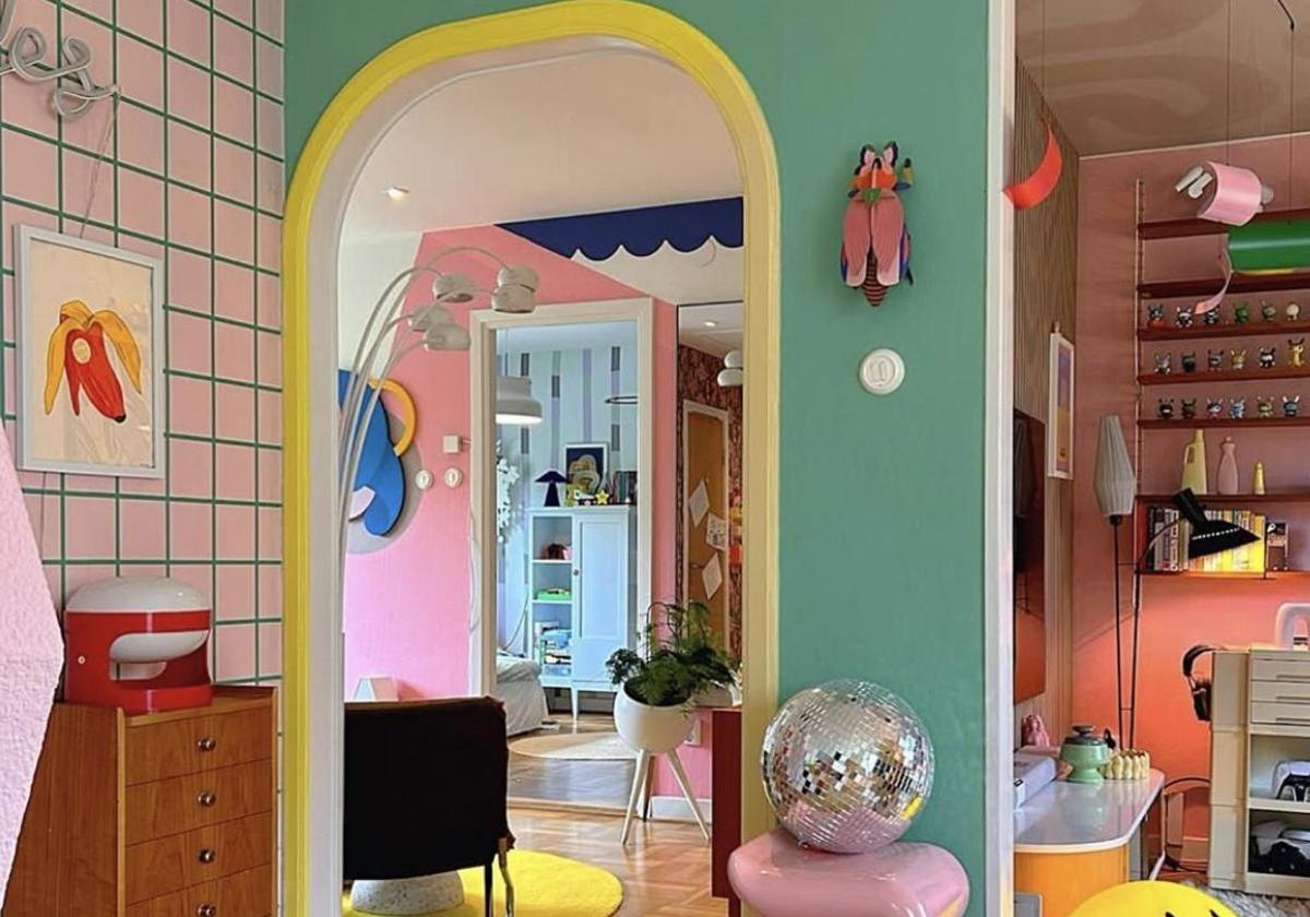
If neutral tones mean nothing to you or if they bore you to tears. If you are one of those who loathe houses presented as if in a magazine shoot where everything goes with everything else and you find yourself longing for a good shot of colour and a certain aesthetic chaos to feel at ease in your own home, then dopamine design is your kind of style.
This trending design concept is committed to decorating homes with tones and objects that make us feel good beyond whatever is the latest 'thing' in interior design or what is socially understood as good taste.
"After years of minimalist, neutral homes, many people are yearning for more vibrant spaces, homes that reflect the personalities of the people who live in them rather than the dominant aesthetic of the moment. It's an interior design philosophy that seeks to free us from the decoratively correct to embrace what really makes us feel good, even if that vintage piece of furniture rescued from the trash or that decorative piece we're so fond of doesn't 'go' with anything."
This is the shared view of several interior design studios in New York, a city where this decorative style trend is making a big splash.
Colour is the starting point for dopamine decor, a style in which all kinds of patterns, textures and prints coexist without getting hung up about the whole look. The latest research shows that looking at an aesthetically pleasing work of art activates our brain's reward centre, the same area that reacts when we are in love, releasing dopamine.
The same studies have also found that a vibrant, energetic environment can enhance and make experiences in it more pleasurable. For example, we may like the same wine better in a room that transmits a good vibe than in a somewhat blander space. So this is where this decorative style comes into play with the hashtag #dopaminedecor accumulating millions of views on social media.
The idea is to surround ourselves with colours and elements that bring us happiness and joy, even if they are unconventional designs and combinations: a pink wall with yellow details, an orange shelf, a cushion with geometric patterns, a poster of your favourite film, a ceramic plate that reminds you of summer holidays, a vase rescued from your grandmother's house, a small collection of toys - whatever floats your boat.
@khloeshow I love it now 🥹🫶🏻🫶🏻🫶🏻 #beforeandafter #homedecor #homedecortiktok #dopaminedecor ♬ original sound - abbymakesamove
In this style there are no rules and that is why the colours chosen to decorate the house do not always have to be striking. Many lovers of this eclectic style opt for softer colours such as pinks, powdery lilacs, mint green or sky blue as this is the palette they find most comfortable.
"In this style you can apply the maxim 'if it makes you feel good, it's good'," says Natasha Smith, founder of the website Dopamine Decor, one of the leading, go-to portals for this trend.
The psychology of colour
White In Western culture white represents purity, innocence, as well as cleanliness, peace and virtue. However, in many other countries and cultures it is the colour of death.
Yellow Regarded as one of the most ambiguous colours because it represents light, power or strength as well as envy, anger or betrayal. When excessively present it can become irritating.
Red The colour red can mean passion, strength, revolution... “and this probably has to do with the fact that it is the colour of blood, which we also associate with vitality, aggressiveness and extreme sensations”. It has been proven that wearing red makes us behave in a slightly more assertive and extroverted way.
Orange This colour is associated with enthusiasm and action, but also with lust, sensuality, the divine and joyfulness. In the political world orange is regarded as the most optimistic colour for marketing purposes.
Blue As the colour of the sky and water blue stands for tranquillity, freshness and intelligence. It is also an elegant and corporate colour: in fact, it is one of the colours most used by companies for branding and image.
Green Links with youth, hope and new life, but green also represents action and organic, the environment. A room painted in soft green promotes relaxation and a sense of well-being.
Black In certain contexts black has negative connotations for being tied up with death, yet in the world of fashion it is the colour of elegance and sobriety.
Pink A colour with very defined attributes: it is the colour of sweetness and delicacy. In addition, our cultural heritage associates it with all things feminine. Fuchsia, however, represents energy and creativity, but can be overwhelming in large doses.
Beige Seen as a soft, conservative colour that evokes warmth and stability without being too flashy. However, if used excessively, it can give the impression of a lack of vitality.
Purple Very much a highly-valued colour in the world of advertising, in particular it is often used in anti-ageing products because of the glamour it exudes.
Publicidad
Publicidad
Publicidad
Publicidad
Esta funcionalidad es exclusiva para registrados.
Reporta un error en esta noticia

Debido a un error no hemos podido dar de alta tu suscripción.
Por favor, ponte en contacto con Atención al Cliente.
¡Bienvenido a SURINENGLISH!
Tu suscripción con Google se ha realizado correctamente, pero ya tenías otra suscripción activa en SURINENGLISH.
Déjanos tus datos y nos pondremos en contacto contigo para analizar tu caso
¡Tu suscripción con Google se ha realizado correctamente!
La compra se ha asociado al siguiente email
Comentar es una ventaja exclusiva para registrados
¿Ya eres registrado?
Inicia sesiónNecesitas ser suscriptor para poder votar.